Tasteful Brand Emblems are Nowhere to be Found
By Chris Haak
12.12.2009
 When Ford’s very butch 2011 Super Duty pickups made their debut, one of the new truck’s most outrageous features was its exaggerated grille. Further adorning this exaggerated grille is probably the second- or third-largest Ford blue oval emblem that you are ever likely to see (the two larger ones being those at an auto show or on a dealership’s signage). It’s easily larger than any other blue oval affixed to any other vehicle in history, although I don’t have its exact measurements.
The almost-cartoonish size of the 2011 Super Duty’s Ford emblem makes a little more sense in that particular application because the truck itself is very large. And with pickup trucks, and three-quarter and one-ton heavy duty models in particular, brand loyalty is probably stronger than in any other vehicle class. I know guys who have gone from BMW to Mercedes-Benz and back again to BMW, but would be hard-pressed to think of any who have switched from Ford to Chevy. So perhaps Ford is just saving its owners the trouble of sticking a Calvin-peeing-on-a-bowtie sticker on the back window, and giving them another outlet to display their brand pride.
Still, the 2011 Super Duty’s emblem is hopefully the zenith of a trend that has been several years in the making. Considering that the emblem consumes about a third of the grille’s width, it seems unlikely that it a future Ford truck could ever possibly have a larger emblem attached to it.
Perhaps the emblem-size growth trend is one of the most telling examples of the importance branding has taken over the past several years. Literally for decades, Ford didn’t affix the blue oval emblem to the front of its trucks in any size. The blue oval logo existed, of course during that time – and made its production-car debut in the 1928 Model A – but it didn’t take such a prominent place in the design of Ford trucks decades ago. You still might find the logo on places like the horn button, door sill plates, or the owner’s manual.
 The last full-size Ford pickup to lack the blue oval was the 1981 F-series. The F-series was all-new for the 1980 model year, and rather than a blue oval, Ford designers stuck individual letters to the leading edge of the hood to spell F O R D. The F-series received a mild restyle for 1982, and one change was the deletion of the letters along with a new grille design that featured – you guessed it – a blue oval front and center. The 1982 F-series’ Ford emblem, however, was less than a quarter of the width of its grille (judging by the size of the emblem relative to the four equally-sized columns that comprise its grille).
The Super Duty’s blue oval emblem was moderately-sized at the time of the truck’s 1999 launch, then grew to almost-cartoonish scale with the 2007 styling update. And now we’re at the point where the logo is nearly as long as an average man’s forearm.
 I don’t mean to pick on Ford alone. If you haven’t noticed this trend, just start checking out the size of the logos on various cars. Take a Honda Accord; a friend of mine has a 1996 Accord sedan that he bought new back then. The 1996 Accord has a tastefully subtle chrome H on its grille (to go with its tastefully subtle styling). Then look at a photo of Honda’s 2010 Accord; not only is the chrome H twice as large, but the car’s design overall tries to make much more of a statement than the 1996’s clean lines did.
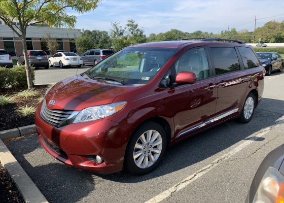
 My wife drives a 2008 Toyota Sienna (the anti-car guy vehicle, I know), and during the countless times I’ve washed it for her, I became well aware of the size of its Toyota T logos front and back. Today I happened to see a first-generation Sienna (model years 1998 to 2003) as we were walking to our van, and I was again struck by the change in emblem size from generation to generation. The T on the back of the old Sienna was only about two-thirds of the size of the emblem on the back of the 2008 model.
AARP members like my father (sorry, dad) would probably argue that the larger emblems are necessary. Not because of failing eyesight as baby boomers age, mind you, but because “all new cars look the same.” And indeed, there is a lot of borrowing of design traits among various manufacturers. The 2011 Hyundai Sonata could easily be mistaken for a Toyota, for example. But as automobile manufacturers expend so much effort and money to stand out in a crowded marketplace and to build their brands, the giant logos may be here to stay for a while.
But just as gun-slit windows may have also reached their peak, and companies that are perhaps less design-focused such as Subaru can see the safety and visibility benefits of a larger glass area, we may also eventually see large logos become less necessary. It’s easy for most people to identify a BMW, Mercedes-Benz, Jaguar, or Cadillac without logos because of those brands’ distinctive design. Toyota probably has more need to slap giant logos on its sometimes-nondescript vehicles, but is it really necessary to slap a 10 inch wide blue oval on a truck that is so obviously a Ford truck? It will be interesting to see if this trend continues on its current trajectory, or takes logos back to a more subdued scale.
COPYRIGHT Full Metal Autos – All Rights Reserved